Select
Select is an input for selecting a single option from a menu.
On this page
On this page

Usage
Use select to allow users to pick a single option from a dropdown menu of predetermined options.
States

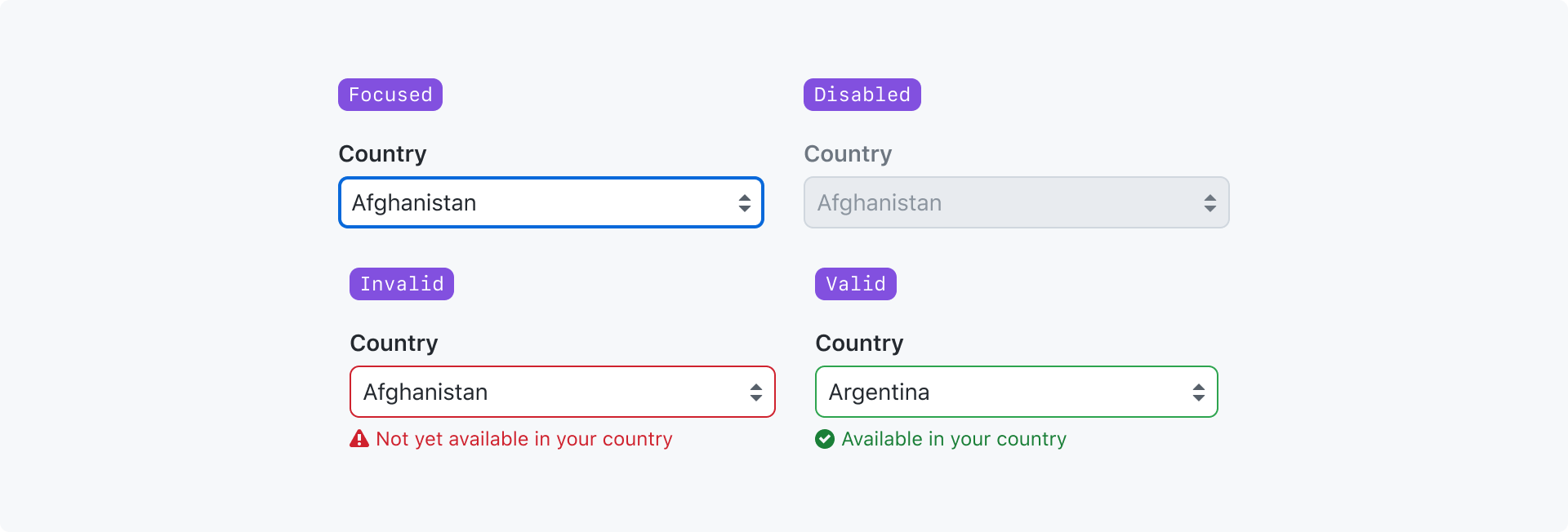
Focused: The input has been navigated to and is ready to accept input.
Disabled: The input cannot accept input or become focused.
Invalid: The value failed validation.
Valid: The value passed validation.
For more information about the "valid" and "invalid" states, see the validation section of the form design pattern guidelines.
Best practices
- Use a select input for longer lists of options. If there are 6 or fewer options and you don't need to conserve vertical space, consider using a radio group instead.
- Provide a default selected option when possible
- Order the menu options in a logical order to make it easier for users to find the option they're looking for. Default to alphabetical order.
Anatomy

Label (required): A short title that labels the group of options and helps users understand the relationship between the options in the group
Required indicator: Indicates that a selection is required
Input (required): Displays the selected value and is used to toggle the dropdown menu
Caption: May be used to provide additional context about the options when the label alone is not sufficient. Caption text should be as short as possible. Caption text may be displayed at the same time as a validation message, or it may be hidden if it only provides redundant information.
Validation message: A single validation message may be displayed to provide helpful information for a user to complete their task. It is most commonly used to explain why a value is invalid so they can correct it and submit the form.
Options
Sizes

A text input can be made smaller or larger depending on the context it's being used in.
You could make an input smaller if it is being used in a tight space with other small elements. You could make an input larger if it's in an open space or it feels out of proportion with adjacent large elements.
Width

By default, a select input will be as wide as the text of it's longest option.
You can render a select input to fill the width of it's parent element.
With a placeholder

You may show placeholder text when no option is selected. The placeholder option is hidden from the dropdown menu when a selection is required.
Interactions
This is just a native select, so the interactions will match the paradigms of the user's OS and browser.
Accessibility
Select placeholders cannot be used in place of labels and should be used sparingly. They also should not convey critical information.
Select options should not be prefixed with emoji, as that disrupts typeahead behavior.